Friday, October 31, 2008

The making of Refine


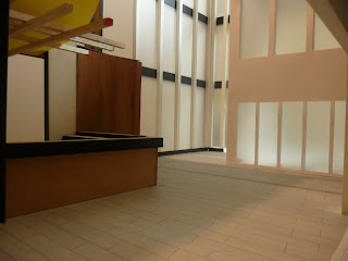
The above series of pictures show the model whilst I was building it. There are a few different views of the space including some interesting views of the outside bar and from behind the bar. Since I didn't submit these on the final poster presentation I thought the web blog was the perfect place show them.
I really liked the views from behind the bar looking out into the lane way as I think it really gives you feel for the closeness that the space can generate even though its quite large. There are some great shadows generated in the space as well in some of the images.
During the making of the model I was forced to wait 3 days to get the laser cut of the structure done because the the severe back log created by many of the 5th year students. This put me on a tighter schedule than I wanted which created a lot of stress.
Generally, I had not major issues other than that. It was just bloody too big!!! Anyway, the bar would make a great place to hang out if you were a student living their!


Thursday, October 30, 2008

Reflections.......On 4B

Hi everyone! Well firstly I'd like to take this opportunity to congratulate everyone on a fantastic collection of works throughout the semester. I know from speaking to you all throughout the semester that you have all found the assignments challenging, frustrating but somewhat exciting and enjoyable like I did. It was a blessing in disguise for all of us to have a small (I'll use Richard's word "Cohort") because we were all able to generate great discussion and easily learn together. On reflection I feel that because of this I was able to learn a lot more and be a lot more productive during class time.

As I mentioned last Tuesday, personally I found this design class to be one of my favourites. During the semester I was introduced to a few interesting architecture books that I must now have in my every expanding collection, one of which I used to help me to generate a concept!! I learned the importance of diplomatic relations and conflict solving whilst working groups and was more vocal in class discussions and reviews.

I tried to teach myself photoshop during the interval and refine presentations and I will continue over the summer break to get better at it for 5th year. 3d modelling will also be an area that i will be focusing on over summer because i feel that is crucial to my success next year. At the moment I feel that I have all these great ideas in my head on sketch paper but can't project them out to the audience properly because of my lack of modelling skills also it gives me great incentive to learn.

On Richard. Well at first when I heard he was going to be the lecturer, I was a bit concerned because I had heard reports from other students that he was a hard-arse, but that was far from the truth. Under Richard, I was able to be a little bit more creative because he forced me to think a lot more about my design - the construction - the design as a whole which is extremely important.

On my fellow students. Well it was very enjoyable doing the class with all of you, there were no troubles or egos and everyone seemed to want to share their ideas and designs with each other which I think could be attributed to the small number of us.

Overall, the really enjoyed this semester and feel good that I was part of the final architecture 4B class for the now defunct bachelor of Architecture coarse. Good Luck to all for 5th year and to those that are doing the one year Master of Architecture programme - see you next year.

Refine assessment / explanation


Hi everyone! Well above are the posters that I submitted last week. Unlike most of you I found it a little bit of a challenge during the Refine project for several reasons but nevertheless I still found it was one of the best ways to finish an archi class.

I chose these images to "sell" my DDI because i felt that the essence of my design
of solids and voids, open and closed spaces was in this lane way space that divides the building in half. In this space students would be zipping from their rooms to their class via this lane way - so showing the effectiveness of this space was one of the goals I set myself when I chose to build this section and photograph it.

In heinsite, I probably should have generated other views of the space for the poster like many of you did but I was unsure if that was allowed. Next year I'll just do it because now I wish I did. I could have sold the space even better - probably a more detailed view of the outside student bar would have been good. Next time.

Firstly, I point your attention to the night time image on the left and the winter afternoon shot on the right. I tried to choose the best two images that I took of the model so that I could show a real mood in the model. The night time image was a rather hard picture to take as I was finding it difficult to get the right amount of light into the model. I played with several lighting options and lighting strengths around the model but wasn't generating the right look. In the end I decided to light the corner only, which is where the foyer atrium is and I imagined this area would be well lit throughout the day and in the evening. The shot showed how diffused lighting through frosted or decorative glass might look from the outside lane way. Looking at the image in heinsite, I probably should of added another small light on the other window just to generate stronger light which would have given more shadows thus giving a better feel of the space at night. Overall I'm happy.

The winter afternoon shot is more about generating a diffused atmospheric shot under a cloudy sky to see if the space can still be well lit naturally at this time. The resulting image seems to suggest that it does. While i was designing the DDI, I was acutely aware that this lane way which cuts through the building had to have access to natural light at all times throughout the year. While i was building the model, I made sure that all sides of the building were built around the outdoor space so that a more realistic daytime shot could be taken. In the end, I believe that I succeeded in achieving this through that image.

Finally, the summer afternoon shot. Well I chose to inhabit the image with people because I felt that this image would be the best to advertise the space. I was lucky enough to have great sunlight falling on the model while this image was taken so it really made the space in the model REALLY feel bright and warm.

I really enjoyed taking this shot and generating this final image on photoshop. As you all would be aware (and I mentioned this on the day) that I am a complete novice when it comes to photoshop - and this was only the second time I had ever generated such an image, and I am extremely proud of the final "Money Shot"!!!! The image needed to convey to you guys what the space is all about. To me, this is a busy space, a loud space, a quite space, a friendly space and a transition space. To convey this meant that the image had to be busy and lively but in subtle way because the space can also be relaxing. I used images that suggested movement- people, light and shadows to help create the illusion. Since this is a student accommodation building, I used students to sell the image. Subtle silhouettes in the background blurred, gives a sense of movement and busyness to the space. I gently warmed up the space with light browns, tans, yellows and cream overtones over the base model to further enhance the realism of the space.

Overall, I think it works very well to convey the idea of the open lane way through the building. And from your reaction and comments to me on the day it seems that I was able to impress and convince you that this space and my DDI can work as a REAL BUILDING.


Tuesday, October 28, 2008

Summary of my Refine project

Firstly, congrats to everyone on getting through the semester. While this has certainly been a difficult semester, I can definitely say it has been a rewarding one, for me anyway. I took the opportunity to develop ideas that I was really happy with, particularly my organic shaped nightclub which I developed for Refine. At times I thought this was quite a stupid idea, in that I really bit off more than I could chew, given my lack of familiarity with organic structure and the complex engineering that must go into it, as well as the huge task of transferring something so freeform to the constraints of paper and models. It all started though with one very complicated drawing, which I didn't get a lot of opportunity to explain to most people.

It started off as the door to the Wool Exchange, which I used the door panels as a site retention plan, the arch as the Eastern and Western Beach Rds and Corio Bay. That was then extruded to be an abstract map of the DDI site with a variety of possible treatments of the area and the shape and skin of our proposals (in short anyway).

We looked at our proposal as being an organic break from the harsh rigidity of Geelong for our masterplan. Of course this was lost largely after the blender option was chosen, but I tried to keep as much of that idea as I could.

Skipping ahead a lot, having been given the odds and ends of the whole DDI project, our group split up the bits and pieces and I chose to do a nightclub/restaurant. Being so close to the waterfront, I wanted it to resemble a fish, and I chose the weedy scorpionfish as a starting point.


The whole thing was quite a nightmare to design, as ive never tried to make something so organic that had to evolve past the conceptual stage. I tried to standardise the shape of the panels/windows, which evolved into ovals. Due to the fact that structure needed to be considered, I had to compromise on the overall look of the building for the sake of being able to build the Refine model, and so the facade evolved into the panelised system seen on the final sketch. Below are my final posters and model.


Monday, October 27, 2008

My journey through 4b

At the beginning of this unit there was confusion in all the groups, nobody knew what was going to be presented to the next tutorial and what the design challenge was. Me, Regina and Andrew started to analyse the site and started to plan on how we wanted to present it. Andrew entered deeply into the layouts of the analysis and me and Regina started to develop a master plan.

Master plan No. 1


Inspiration: A Swedish “outside shopping mall” that has a glassed roof above the shopping street.

On the presentation we got critics on cutting of traffic from Brougham street, nevertheless the entire
group agreed on that the traffic was a problem to get a solidarity between the school.

Our group got two new group members, Anna and James; they had similar idea to ours. They were intended of having a “spine” that go though the old train track and became a connect link between the school, which we tried to develop. As a group we also created spaces were people from the University and public people interact with each other such as library, shops, gallery, backpacker, cafés etc, those kinds of spaces we named “bleeding spaces”. In our new master plan we still kept the library that linked every school together.

Master plan No. 2
We tried to keep the natural path ways that take the public to the campus area; due to the pathways we created entrances/courtyards. There is lack of traffic lights on the original site, so by placing lights on the north and western side it facilitate the walk ability for the public to get to campus.


After the groups presented their master plan it got decided that the master plan Rick, Collie, George and Christine presented was the plan everyone were going to design from. Although our group became “the bleeding group” that was going to design and solved the spaces were public
and university people cooperate, which was our main idea. We also had to solved the bender.
At this point we as group felt confused and did not know what our main task were what we were supposed to resolve and design. Therefore we put most of our focus on resolving the bender, because some parts were lacking. The bender needed to be at least 5 meter above from the normal street level, which makes the bended 10.7 meter above the ocean level on the crossroad between Brougham Street and Clare/Cunnigham Street, this action will give all the cars and truck the opportunity to pass by and it also release parts of the exhaust from the cars. To release more of the exhauster and to bring light into the tunnel we created voids on the bender, and that also creates path-ways for the walkers.
Another problem we tried to resolve was how we were going to design the ramp from Brougham Street up the bender. We soon realized that it could not be possible to create a 70 meter long ramp, so we designed a stair that have a sculpture form and involved the bender.

We divided different parts of the bender and everyone got a building/site to design. My site is where the courtyard ends of the present waterfront campus and the suggestion is to build a courtyard with a spiritual centre.
I started to some research on spiritual centres and churches. After doing some research I found a church that I got very inspired of; the Italian Jubilee church by Richard Meier.

I wanted to create a space that did not have specific religious trademark and hade a simple design. Material such as concrete, stone and glass are as well very simple and easily get in contacted with. The circle shape symbolized a reunited circle, some kind of reincarnation. I wanted to get a lot of light into the building so therefore the building has an open, round skylight. The building was placed in the middle because I wanted to get a focus and that is also the reason why parts of the bender continue into the courtyard and building.
Digital picture and a section of the spiritual centre


After focusing on the spiritual centre I realized that the area around the spiritual centre needed a lot of work. Tucker pointed out why I had the building in the middle of the site, it acquires big space and it left corners of the courtyard that are difficult to develop good urban spaces. So I did some sun studies on the site, research on the elements that were placed there and I could take use of. I did as well research on landscape architecture and how people fallow different paths.

The DDI:


It have four entrances which create clear axis through the building and different pathways. The dome gives shelter for the rain and wind, as well as it gives reflected light inside the building. On the south-east side of the Zen garden there is a view point were you ca se the bay.


People can be connected to the courtyard by five different entrances. The different paths on the area make people choose a direction which brings theme to diverse meeting points, such as the winter garden, the Zen garden, the spiritual centre and fountains.

The inspiration comes from Japanese gardens were the mixture of soft greenery and hard stone gives an excited collaboration.
The furniture:
Inspiration Link to my building


I wanted make a furniture with two function, so therefore it became a light and a table.

Refine: Just because I have worked digital the entire time I decided to make a model, to see if the reflected lighting would work. The pictures show the result of the model:


Summery: This unit been a good fun to do, it requires a lot of work but in the end I have learn a lot and I am satisfy with my development and how everything turn out. Some points of the unit were confusing, i.e. when our group did not really knew what we were going to present to the master plan presentation, but it worked out.

I appreciated the smaller group work, it help me to understand more how things worked here at Deakin University, so thanks to Regina, Andrew, James and Anna. Thanks everyone else and good luck with every thing. (If anyone is coming to Sweden, here’s my email address: bb06pqpa@jth.hj.se)

Sunday, October 26, 2008

Hi everyone!

I just want to say thank you all for a great semester. I can truly say that I learned a lot during this unit, and that is because of you guys. I wish you all good luck with the rest of your studies and work in the future. Hope you will have a great, relaxing summer... and if you ever end up going to Sweden, here is my e-mail address c_hamretz@hotmail.com

See you
Christine Hamretz

Project 3-Refine

Below are my 3 different internal shots during the summer, winter and evening.
Due the north western orientation, I found that the lighting during the day was quite diffused light but in the afternoon the suns shadow did enter into the shop front. The projected balcony helps prevent excessive heat to penetrate the space, however, during winter, the afternoon sun pentetrates the shop front creating an inviting setting for all.


During this project I learnt alot about presentation and design. I hope to take these skills and implement them in my further studies. This type of presentation I felt was the most effective way of showing the feel and intention of the space. It does not need to much explaining to see what the design intent is.

Project 3 - Refine

The area i decided to focus on for my refine project is the area highlighterd in yellow. I found that this area would best represent the design intention for the building. The cafe is quite intimate and relaxing - I designed the area in this manner to provide a place for students to prepare themselves for a big day or wind down after an exhausting afternoon. It also provides a place for students to dicuss and reflect ideas of one another.


2D - 3D review photos

Some photo's from student reviews.